Designing APH Press Books: User Experience with Everyone in Mind
As the collection of APH Press books grow, we’re always looking for ways to design our books with our end-users in mind. Press books, geared toward college-age students and professionals, are the cornerstone of our field. With topics like O&M and access technology to the Foundations book series, educators and instructors rely on these texts to support their work every day. We’re excited to make the user experience of these books as intelligent as the knowledge inside them. Our newest APH Press Book, Foundations of Vision Rehabilitation Therapy, previously titled Foundations of Rehabilitation Teaching with Persons who are Blind Or Visually Impaired, is the latest example of how our design team is bringing these books into the modern era.
The Green Book
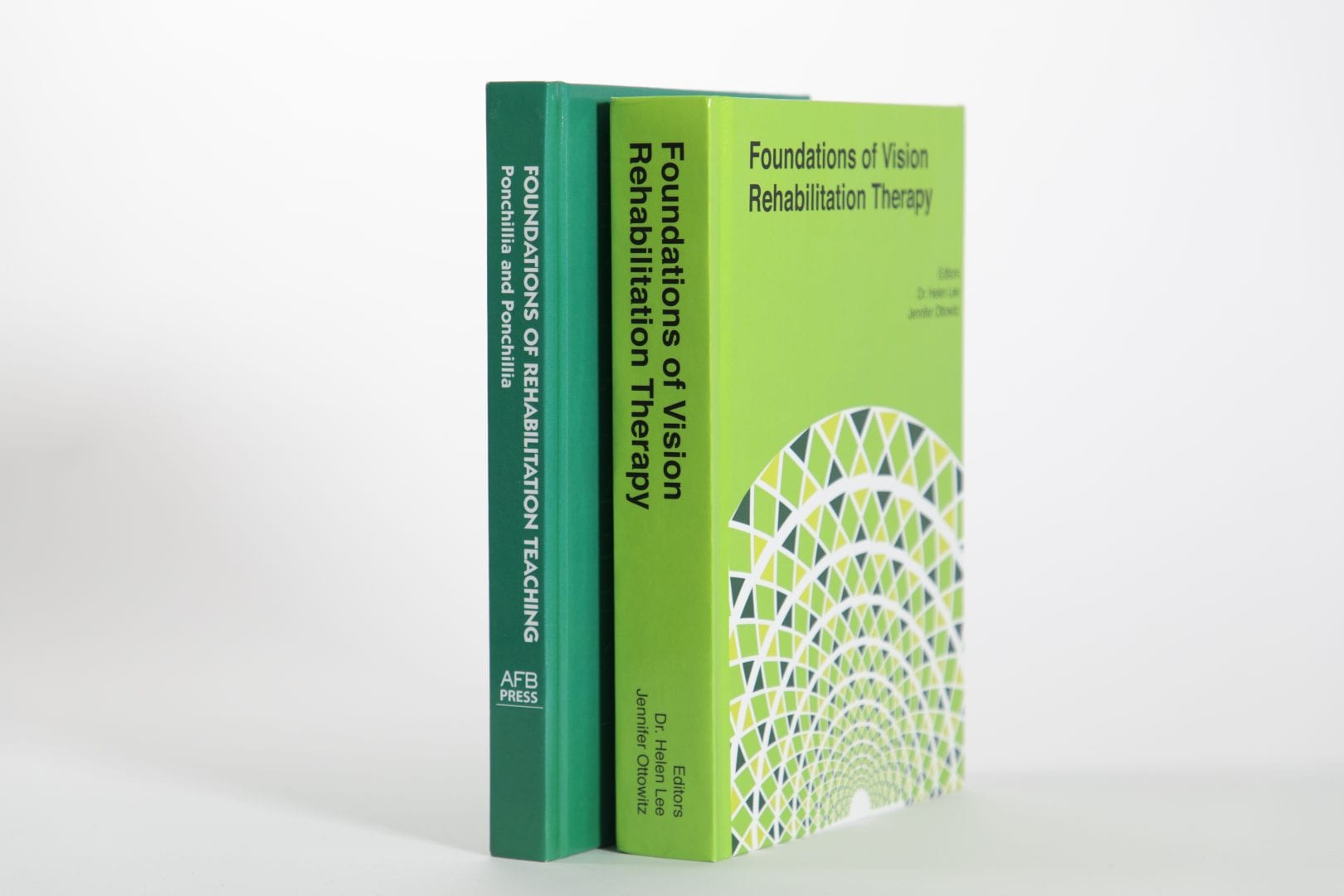
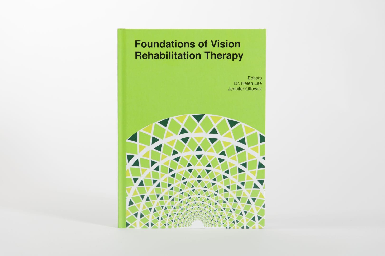
If you’re in the field of blindness you’ve probably heard of Foundations of Rehabilitation Teaching with Persons who are Blind Or Visually Impaired, lovingly referred to as “the green book”. Each book of the Foundations series has a different color cover and is often referred to by its color for short. We wanted to honor that tradition and keep “the green book” alive in our redesign with a modern flair. “The original cover was bare-bones type only, a dark green background with white type,” said Laura Greenwell, a graphic designer at APH. “The new cover is more dynamic with a colorful Fraser Spiral and a complimentary and energizing bright green background.” The APH Creative Services team was excited to bring this cover to life with this redesign. You can expect to see the same treatment to the rest Foundations books as they get updated.
Going Swiss
The decisions made while designing our new Press books are more than just for the sake of aesthetics. There’s a lot of thought and research behind the choices made and how they fit into the APH brand. “We follow the style of Swiss Design,” said Laura. “It is simple but beautiful. It follows a grid design, which makes it easier to read. We strive for more white space, instead of crowding everything on the page and making it hard to read. This style of design follows my favorite saying “Please don’t stuff 10 pounds in a 5-pound bag”.”
UX: User Experience
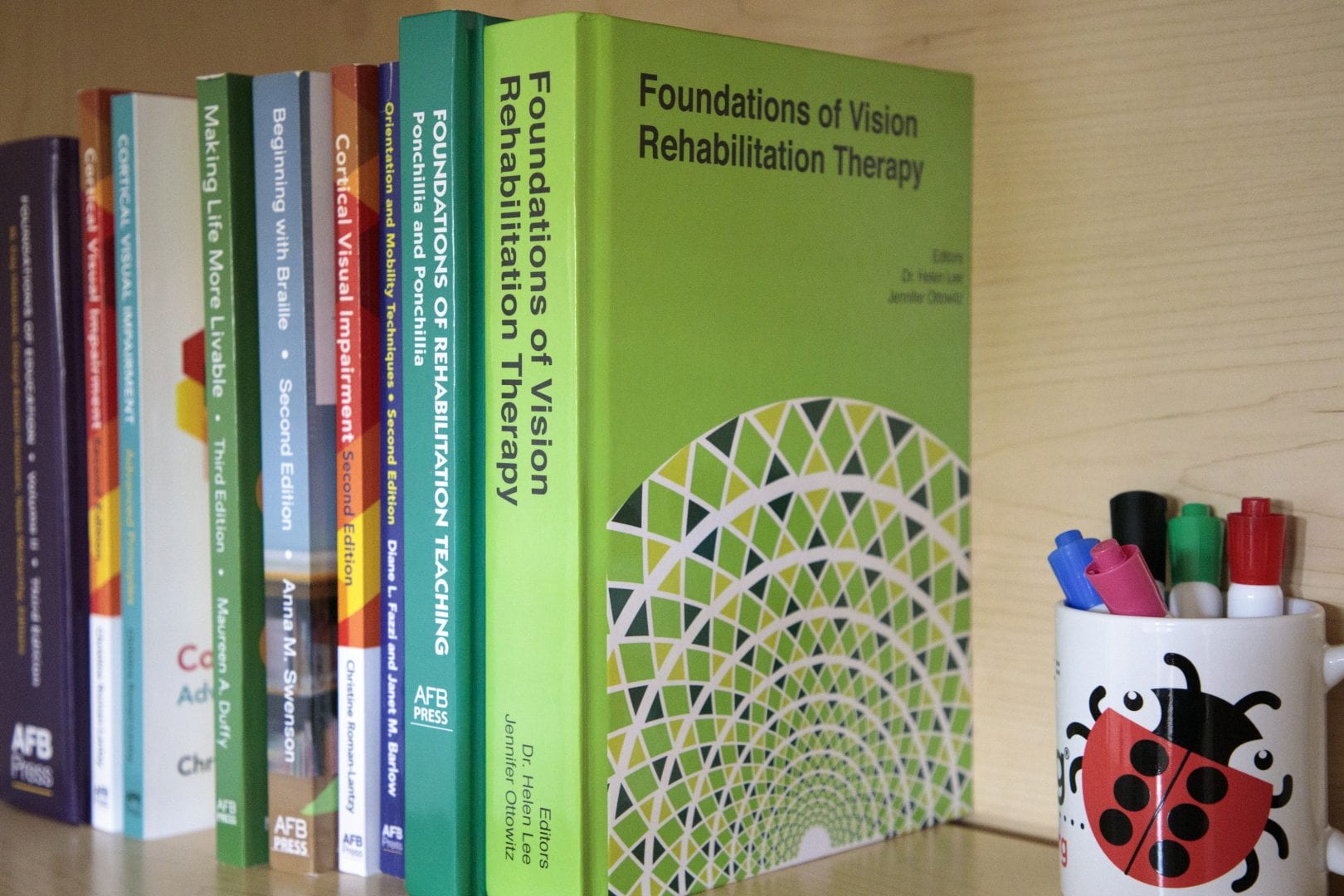
From the typeface and layout to the contrast and color, every part of the design process begs the question- what will make the best experience for the end-user? We know that readers with typical vision as well as readers with visual impairments will utilize copies of these press books for years to come. For Foundations of Rehabilitation Therapy, Laura said the font choice was easy. “The new book is set with the Helvetica Font Family. It is very easy to read close and at a distance, including the spine of the book when on a bookshelf. We will keep Helvetica for the rest of the Foundation Book series, though, soon we will be launching a new font, specifically designed for APH that will appeal to our low vision readers. We can’t wait to share it with you all.”
The Font of the Future (SNEAK PEEK!)
While we can’t give too much away, we can say the goal of APH’s new typeface is to provide people with low vision the best reading experience possible. This is being accomplished through extensive trial and research with one of the leading type designers in the world. By adding together a thousand small decisions, and reaching deep into traditional forms and historical techniques: each letter is given a unique, easily differentiated, yet familiar shape. As our principal type designer put it, “we are giving every letter a fighting chance to establish its own identity in the context of a word.” Finally, people with low vision will be able to read without having to put up a fight.
Order your copy of Foundations of Vision Rehabilitation Therapy
Share this article.
Related articles
Switch to Using the Roland in Production Department Streamlines Processes and Creates High-Quality Graphics
For the past year, APH’s production department has been focusing on improving efficiency within the department. Thanks to the efforts...
About the APH Accessible Tests and Textbooks Department
To best serve our customers, the Accessible Tests and Textbooks Department offers a wide range of services. Accessible Tests: Extensive...